How To Easily Customise Bullet Points in Squarespace
Customising bullet points and numbered list icons on your Squarespace website.
Changing up your bullet point icons is a great way to individualise your website and keep it on-brand. It’s really easy on Squarespace, with just a small snippet of code. You can use a small image – perhaps your logo or a branding element – or almost any symbol or emoji. And once you know that you can also add custom bullet points to numbered lists, or perhaps use different bullet points in different places or pages on your Squarespace website, the possibilities are endless!
Numbers or Bullets: Ordered Lists vs Unordered Lists in Squarespace
Squarespace allows us to use either traditional bullet points or a numbered list when typing in a text block. From a code perspective, these are known as ‘ordered lists’ and ‘unordered lists’. The numbered list is ‘ordered’ as, well, the numbers give it an order. That’s the best way to remember it. Bullet points and ‘unordered’.
This becomes relevant when looking at the CSS snippet below. The first part of the snippet has either ol or ul – ordered list or unordered list – this tells Squarespace which type of list we are targeting. So, if you want to change your regular bullet points, start with ul and if you wish to replace your numbers for a custom icon, or target those numbers to change their font, colours etc, you’ll want to start the snippet with ol.
The two codes below effectively remove the default number or bullet point symbol.
Bullet Points aka Unordered Lists (UL)
ul [data-rte-list] li>*:first-child::before {
    content: " " !important;
}
Number Lists aka Ordered Lists (OL)
ol [data-rte-list] li>*:first-child::before {
    content: " " !important;
}
Option 1: Replacing Squarespace Bullet Points with Your Image or Logo
This is the slightly more complicated of the two options. I personally prefer to use a symbol or unicode character (see Option 2, below!) but if you want something truly custom, it’s totally possible too! Firstly, you’ll need your image. You could make this in Canva, Photoshop, Illustrator or use an image file you already have. However, it’s unlikely you have something small enough! If you’d like to use a logo or brand element, you’ll need to resize it first.
A good bullet point image is:
Clear at small sizes
Around 40px x 40px in size
Transparent background
PNG format
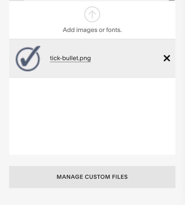
Once you have your image, head to Design >> Custom CSS. You’ll need to upload the tiny image to Squarespace. To do this, click ‘Manage Custom Files’ at the bottom of the CSS window and drag in your desired image.
Drag and drop your image into the Manage Custom Files section in Design >> Custom CSS.
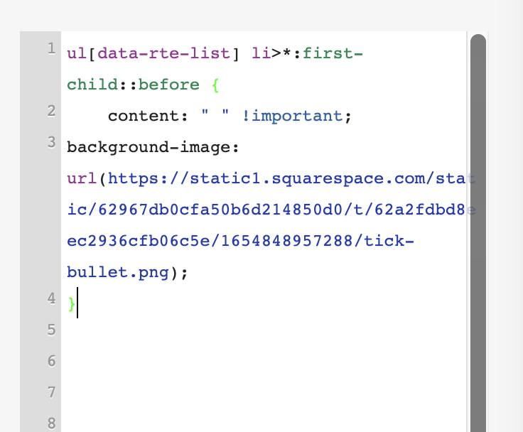
Next, you’ll need to add a code snippet to the Custom CSS panel. Paste in the snippet below than remove the URL.COM. Keep your cursor in place and click on the image you just uploaded. This will add the unique URL of your image to the code snippet.
There are essentially two things happening in this snippet, firstly content: “ “ !important; tells Squarespace to remove the existing default bullet point symbol so the space is blank. The background-image line of the snippet, directs Squarespace to use your uploaded image to fill that space, basically giving that space a background.
//REPLACE BULLET POINTS WITH IMAGE//

ul[data-rte-list] li>*:first-child::before {
    content: " " !important;
background-image: url(URL.COM);
}
The code to the left, adds the image as a background to the space where the bullet once was.
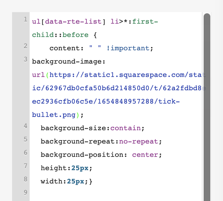
You’ll probably need to tweak the width and height a little if you use a background image. One way of doing this is using background-size: contain; this keeps the background image contained within the space available and background-position: center; ensures the image is central. Background-repeat:no-repeat; will stop the image from repeating and you being able to see a second one sneaking into the frame. You can also set the height and width of the area.
ul[data-rte-list] li>*:first-child::before {
    content: " " !important;
background-image: url(https://static1.squarespace.com/static/62967db0cfa50b6d214850d0/t/62a2fdbd8eec2936cfb06c5e/1654848957288/tick-bullet.png);
  background-size:contain;
  background-repeat:no-repeat;
  background-position: center;
  height:25px;
  width:25px;}
And there you have it! If you struggle to get your image perfectly aligned, you might prefer to use a unicode character or symbol such as in the next method I am about to show you.
Option 2: Changing the Squarespace Bullet Point Symbol
This is my preferred method. Aside from being a little quicker as you don’t need to create an image, it’s much easier to keep everything aligned. There are so many symbols or emojis to choose from, there will almost certainly be something that suits your brand! In this exampleYou can, use almost any character you like. A great place to look for them is here. However, here’s a handy table of the most universal:
| Name | Symbol | Code |
|---|---|---|
| Arrowhead | ➤ | \27A4 |
| Arrow | ➔ | \2794 |
| Star | ★ | \2605 |
| Circle Star | ✪ | \272A |
| Eight Point Star | ✷ | \2737 |
| Note | ♫ | \266B |
| Diamond | ⬥ | \2B25 |
| Concave Diamond | ⟡ | \27E1 |
| Circled Bullet | ⦿ | \29BF |
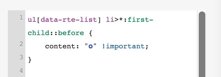
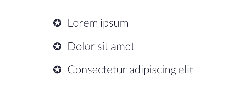
In this snippet, I’m replacing the standard bullet point symbol with one of my own. The \272A is the CSS code for the symbol I’ve chosen. You can, however, just paste the symbol itself right in!
ul[data-rte-list] li>*:first-child::before {
    content: "\272A" !important;
}
The bullet point symbol is replaced by a new symbol, a star in a circle.
Can I Change the Colour and Size of Bullet Points in Squarespace?
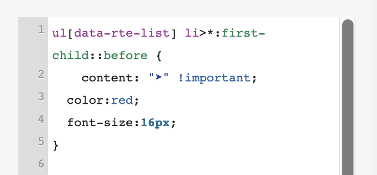
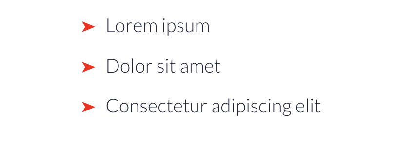
Here’s a second example, with an arrowhead icon. In this snippet, I’ve added color: and font-size: this allows me to change the colour of the symbol and also make it smaller/larger relative to the text. I personally recommend using the same font size as the text itself but a little smaller or larger might even things out, depending on the symbol you use. If you are using the default Squarespace bullet point and just want to change the colour, you can do that by removing the content: line from the snippet below.
ul[data-rte-list] li>*:first-child::before {
    content: "➤" !important;
  color:red;
  font-size:16px;
}
Bullet points with a custom colour to match your theme or brand.
Can I Use an Emoji as a Bullet Point in Squarespace?
You can, in fact, use an emoji as your bullet point symbol! Remember that emojis look slightly different when viewed on different devices but you can always check these out on emojipaedia.
ul[data-rte-list] li>*:first-child::before {
    content: "👍" !important;
}
Using an emoji as a bullet point in Squarespace.
Targeting Specific Bullet Points to Customise
Changing the Colour of One Bullet Point List in Squarespace
You might only want to use your custom bullet point symbols in a certain place on your website. For example, perhaps you’d like traditional bullet points or a more neutral symbol on most of your website, but on one specific list, check marks or ticks would be better.
This is really easy to do. Firstly, you’ll need to find the BlockID or SectionID of the block or section where the bullet points are. I have a tutorial here about how to do this. You can then wrap your bullet point CSS inside some curly brackets { } so that it will only apply to bullet points in that block or section.
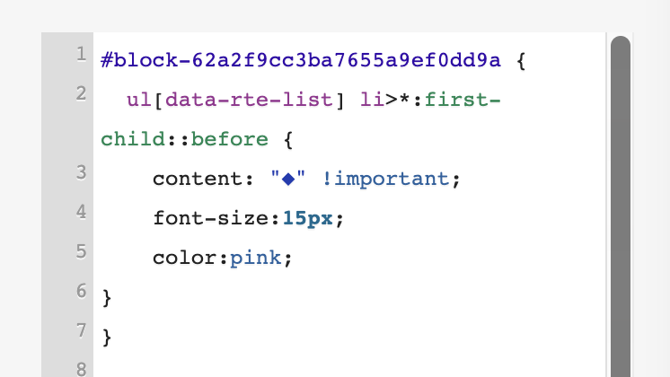
Here I’ve added a pink diamond to one set of bullet points using the BlockID. The other set of bullet points, which is in a different text block, has remained the default Squarespace symbol.
#BLOCK-ID {
  ul[data-rte-list] li>*:first-child::before {
    content: "◆" !important;
    font-size:15px;
    color:pink;
}
}
By targeting a BlockID or SectionID, we can customise specific bullet point lists.
Adding tick, check and cross symbols to lists in Squarespace
One last demonstration! If you’re building out a sales page, you may very well want to have two lists with either ticks or checks (depending on whether you speak US or UK English!) and crosses. By using the BlockID trick above, we can set up two different types of bullet point symbols on the same page. Another way to do this, is to made one list a OL and one list a UL and target them separately that way.
#BLOCK-ID {
  ul[data-rte-list] li>*:first-child::before {
    content: "✓" !important;
    font-size:15px;
    color:green;
}
}

#BLOCK-ID  {
  ul[data-rte-list] li>*:first-child::before {
    content: "✘" !important;
    font-size:15px;
    color:red;
}
}
Checks/ticks and crosses on lists are great for sales pages.
Congrats, you’ve customised your Squarespace bullet points!
As you can see, there are tons of options to customise your bullet points in Squarespace.
Need further Squarespace support?
If you’d like further help and assistance with custom bullet points, or anything else in Squarespace, there are a number of ways I can help. I offer one-to-one support sessions via Zoom or can complete customisations on your website at an hourly rate. However, my zone of genius and bread-and-butter service is building fully custom websites for small and solo businesses as well as re-designing and customising existing websites on a day and half-day basis.

