Ultimate Guide to Customising the Form Block in Squarespace Using CSS
Update 2024: This is a post written in the days before Squarespace 7.1 but it works just fine on both 7.0 and 7.1 Squarespace websites!
As a professional Squarespace Web Designer, I’ve seen SO many questions asked around the web regarding how to change this or that on the Squarespace form block. There’s some great info here and there answering users specific questions (How do I make the text pink? How do I have just a line rather than a box?) but I decided it was time to put together a guide to help anyone and everyone figure out their own customisations by understand how to target each particular part of the form block.
So here it is… Kayleigh’s Ultimate Squarespace Form Guide for CSS Beginners (Part One). Or something like that.
This guide is split into two parts: targeting and then customising. First off, you need to know exactly what part of the form you want to target, i.e. how to ‘tell’ Squarespace which part of the form you want to change, then you’ll tell it what to do such as, add a border, change the colour, change the size, add some padding etc.
Part One: Targeting The Squarespace Form Block Fields
As above, you need to know exactly what part of the form you want to target, i.e. how to ‘tell’ Squarespace which part of the form you want to change. I’ve targeted each of the fields I’m going to discuss and coloured them in green to give you an easy visual guide. This is one of the easiest ways, when trying out CSS to check you’ve successfully targeted the right item on your page. Add a background for example, and it’ll be immediately obvious that you’ve got the right selector.
I've included an image for each of what would go in DESIGN >> Custom CSS and an image displaying what the resulting look would be on your form. It ain't pretty, but hopefully it's clear, which is what I’m going for!
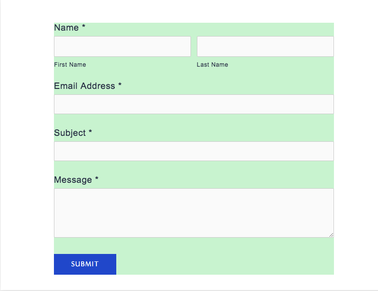
.form-wrapper
This is the form as a whole, including the button.
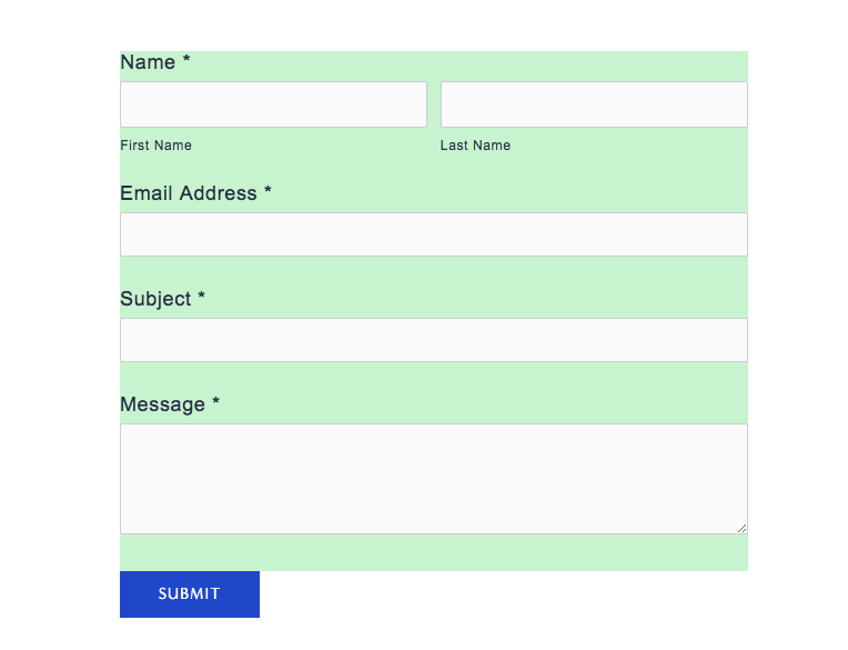
.form-wrapper .field-list
Everything except the button.
.form-wrapper .field-list .field
The area below and above each section on the form, but not all of them as one.
.form-wrapper .field-list .field .field-element
This are you ‘boxes’, where the user would type in their information. If you want to do for the popular 'line rather a box' look, this is what you'll need. You just add a border to the bottom (see examples below).
.title
The text above each field, such as ‘name’, ‘email address’ and ‘message’. By default, Squarespace uses your body font settings. [NOTE: 'first name' and 'last name' can be targeted using .caption]
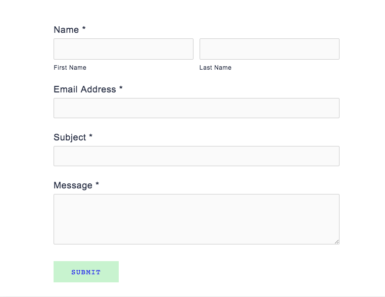
Your submit button. This is customisable in DESIGN >> STYLE EDITOR to an extent, but targeting with CSS will allow you to do more.
.button.sqs-system-button.sqs-editable-button:hover
Your submit button when a user hovers their mouse over it. By default, Squarespace sets this to simply bring the button to an 80% opacity, but this can be overridden. Perhaps you'd like it to change colour, to increase in size.
Part Two: Customising The Squarespace Form Block
This is where the fun part begins. It's time to start adding customisations to your targets. I've detailed some of the most popular (and easy) below.
BACKGROUND COLOURS
Super easy. This is usually used to add a background colour to the whole form using .form-wrapper or the input boxes using .form-wrapper .field-list .field .field-element. In the examples in part one, you can see how I used the to display the target areas with a light green colour.
FONTS, FONT SIZING AND FONT COLOURS
Best used on the .button.sqs-system-button.sqs-editable-button and .title and .caption selectors. You could use:
font-family, font-size, font-color, text-align, text-shadow, text-transform, text-decoration, text-indent, text-spacing or line-height to name but a few.
PADDING
Padding gives elements on your page room to 'breath' and is useful when combined with background or border tags in particular. You can add padding 10px on all four sides on an element using:
padding:10px;
or
padding-top:10px;
padding-bottom:10px;
if you perhaps just wanted to add padding vertically.
BORDERS
You can either add a border on all four sides, or just one (or two or three, I guess). Style, width and colour are also customisable.
border-style:solid;
border-color:red;
border-width:3px;

border: 3px solid red;

border-bottom:3px solid red;
For example, a simple border, with and without colour:
Targeting the .field-element selector gives the answer boxes a border. And getting all girly...
Looking to use a custom font on your Squarespace website form? Check out this post.
Ready for some examples?
Honestly, when I'm building a site, I LOVE making the contact form stand out or suit the brand. Here's a couple of examples of what you could do to yours. Get creative, play around, have fun and as always shoot me a message if you need a hand. My Squarespace SOS specialises in just these kind of customisations.
I'm not gonna lie, these aren't so pretty... but I had to get this post finished before the coffee shop kicked out. I have, however, tried to show a good range of customisations and make them quite ‘obvious’ so you can see how the different bits of CSS have worked.
.form-wrapper
{background:#EBF3FF;
padding:20px;
border-style:solid;
border-width:1px;
border-color:#65758C}

.title
{font-family:roboto;
  text-transform:uppercase;
  font-size:16px;
  text-align:left;
  text-indent:20px;
color:#65758C;}

.caption
{font-family:roboto;
  text-transform:uppercase;
  font-size:10px;
  text-align:left;
color:#65758C;}

.form-wrapper .field-list .field .field-element
{border:none;
border-bottom-style:solid;
border-bottom-width:2px;
border-color:#65758C;}

.button.sqs-system-button.sqs-editable-button
{background:#65758C;
font-family:roboto;
letter-spacing:3px;}
.title
{font-family:baskerville;
  text-transform:NONE;
  font-size:16px;
  text-align:center;
  text-indent:20px;
color:#AA3365;}

.caption
{font-family:baskerville;
  text-transform:uppercase;
  font-size:10px;
color:#AA3365;}

.form-wrapper .field-list .field .field-element
{background:#F7ECF1;
border-style:none;}

.button.sqs-system-button.sqs-editable-button
{background:white;
  color:#AA3365;
  background-color:#F7ECF1;
font-family:baskerville;
text-transform:none;
padding:12px;
padding-left:50px;
padding-right:50px;}
//CONTACT FORM//
.form-wrapper .field-list .field .field-element
{background:#F9F5F3;
border-style:none;
  border-bottom-style:solid;
  border-bottom-color:#313e50;}
.title
{font-family:playfair display;
font-style:italic;
font-size:16px;}
.form-item.field.checkbox
{font-family:playfair display;}
.caption
{text-transform:uppercase;}
.form-wrapper .field-list .field select
{font-family:lato;
font-size:12px;}
.form-wrapper .field-list .field .option
{padding-top:2px;}
…and there you have it!
Unfortunately, I’m no longer able to reply to individual emails asking for CSS assistance or Squarespace troubleshooting due to the dozens of requests I get a week and the fact I am fully booked for custom builds. However, if you’d like something fixing for a small fee as part of my Squarespace SOS service, you can contact me here.


