Project Case Study: Bondi Zinc
Update 2021: The brand enjoyed my concept design so much, they asked me to make it a reality and we worked together to build the new Bondi Zinc website!
In Summer 2020, to help me survive my longing to be back on the road and on my way to Sydney, I threw together a concept design for @bondizinc! Concept designs are designs professional web designers create to practice their skills and sharpen their creativity, rather than for a paying client. Bondi Zinc is a sunscreen start-up owned by two of the lifeguards based at Bondi Beach, Australia. I came across the brand while catching an old episode of Bondi Rescue – and feeling very sorry myself that my extended stay in Bronte had to be indefinitely cancelled due to COVID. A perfect project between clients for channeling the surf vibes until I can get back to the real thing.
To overhaul Bondi Zinc’s online presence I created a new colour palette selected from the hues of a Bondi sunset combined with the iconic blue uniforms of the Waverley lifeguards. This gives a lighter feel and appeals to a wider audience – from surfers to sun-bakers to parents. Statistically, the majority of sunscreen purchases are made by women and mums so it’s important to have a fresh, light, family-friendly feel to the site as Bondi Zinc prides itself on being suitable for all.
Animated effects give the site a modern feel and engage the visitor’s eye while scrolling. Icons and key features communicate the products benefits and unique selling points effectively and at the bottom of the page, a scrolling product carousel encourages immediate engagement with the online store along with a link to find brick-and-mortar stockists.
PLEASE NOTE: This is a concept design only. All attempts have been made to notify the copyright holders both in person, via email and via snail mail. Bondi Zinc is © Daniel McLaughlin and Michael Jenkinson. “Bondi Zinc Sunscreen”, “Bondi Zinc Owned By Lifeguards Use By Lifeguards” and the original double framed rectangular logo are all registered trademarks.
Want to compare to Bondi Zinc’s Previous and Current Site Designs?
The earlier versions of the site (2013 and 2016) provide are dated and static. The darker designer doesn’t correlate with the idea of ‘sun’ and ‘outdoors’. There’s limited information and not much personality to endear the brand to a consumer.
The 2019 (bottom) version has lightened the page style and introduced a new and improved branding, but the holding page offers little to build anticipation, connection or brand loyalty. A mailing list subscription, some video content, social media links, etc could have made the page into a useful marketing tool until site launch. Also, it’s on the dreaded… Wix 🤦🏼♀️
For an improved user experience and better marketing of the product, an interactive database of stockists could appear on the site. The dynamic map uses the brand colours for visual consistency and a premium touch vs the standard Google Map colour scheme. Filter options include searching by city and store type – pharmacies and surf stores – positioning the brand in front of both family and sports/activity consumers.
Additionally, the shop should be filterable and allow the sorting of products by price to allow consumers to quickly and easily find the right products for them.
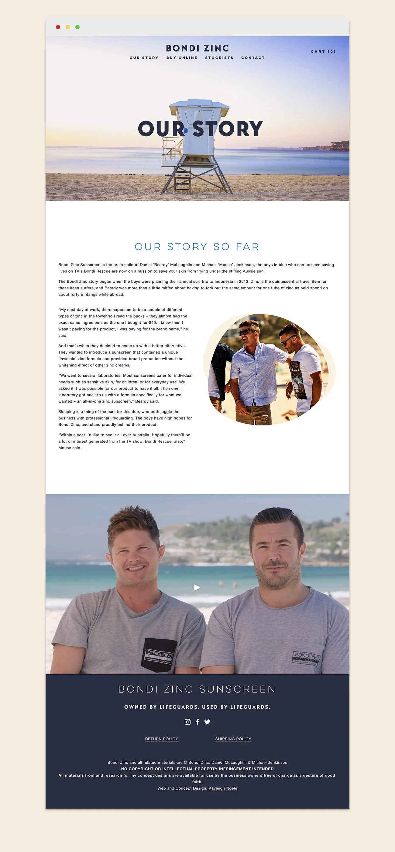
An attractive and engaging ‘Our Story’ section builds both brand loyalty and reinforces the brand’s USP as a lifeguard designed and approved product. Video not only engages visitors but achieves improved search engine performance.
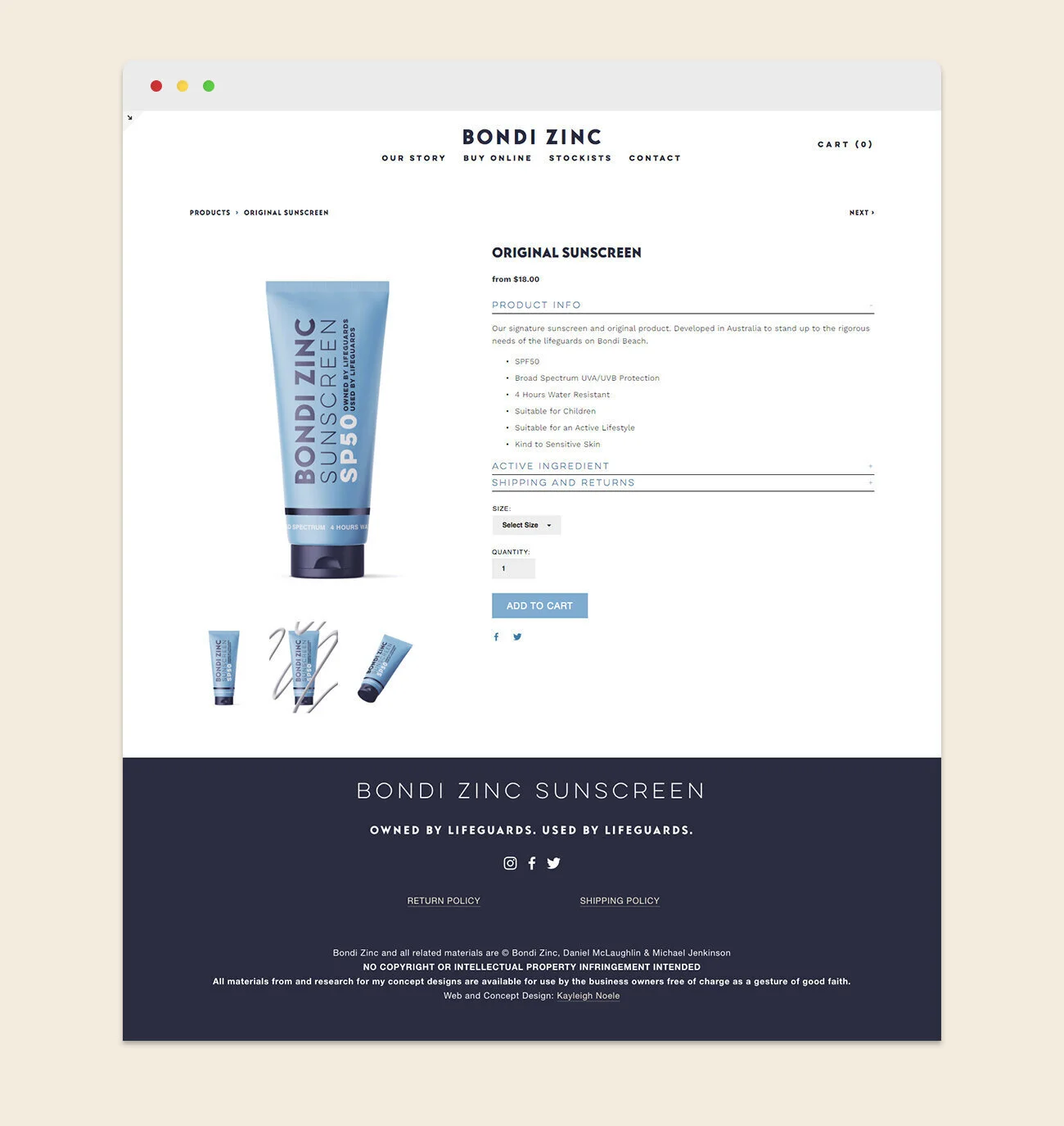
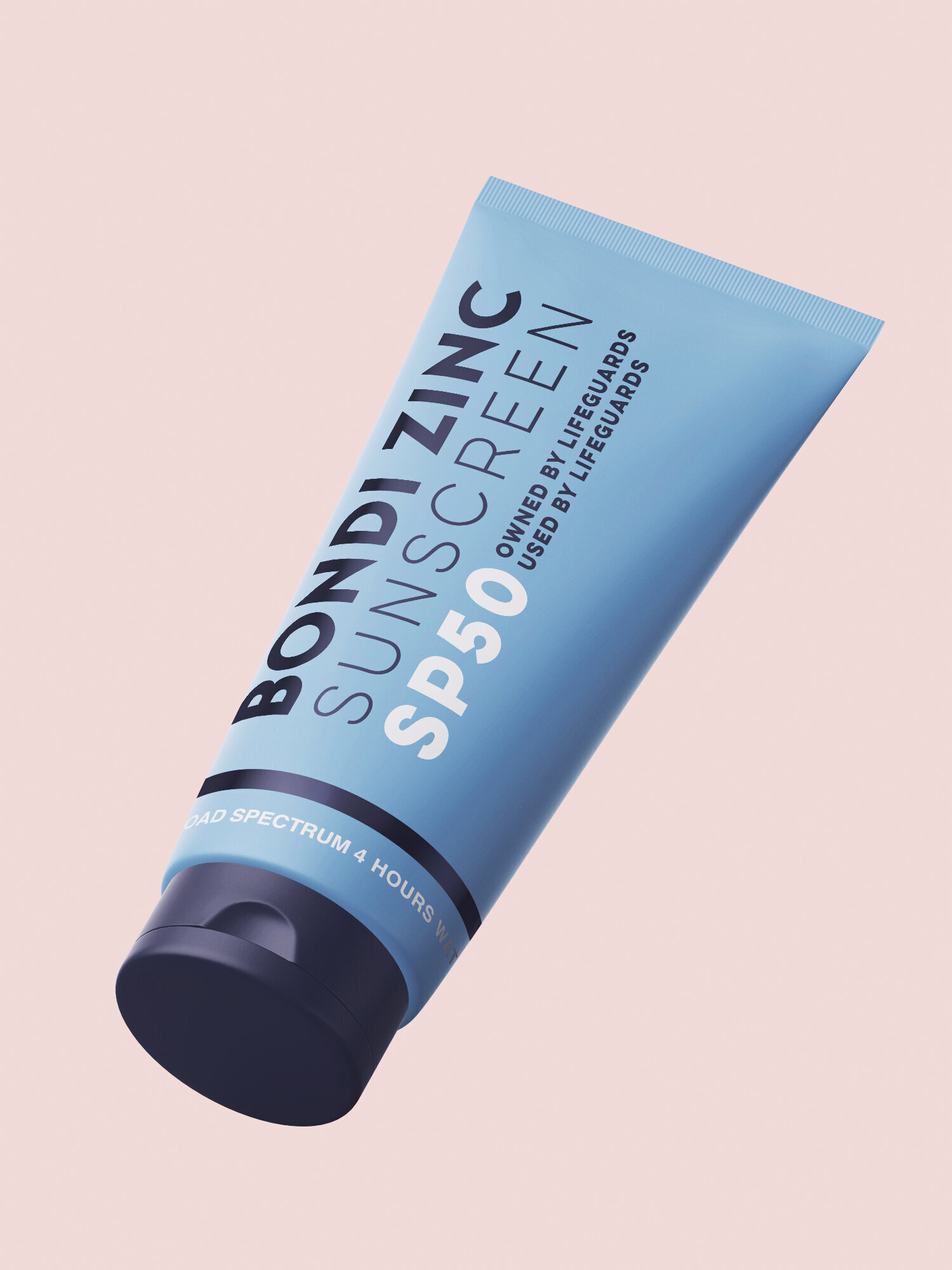
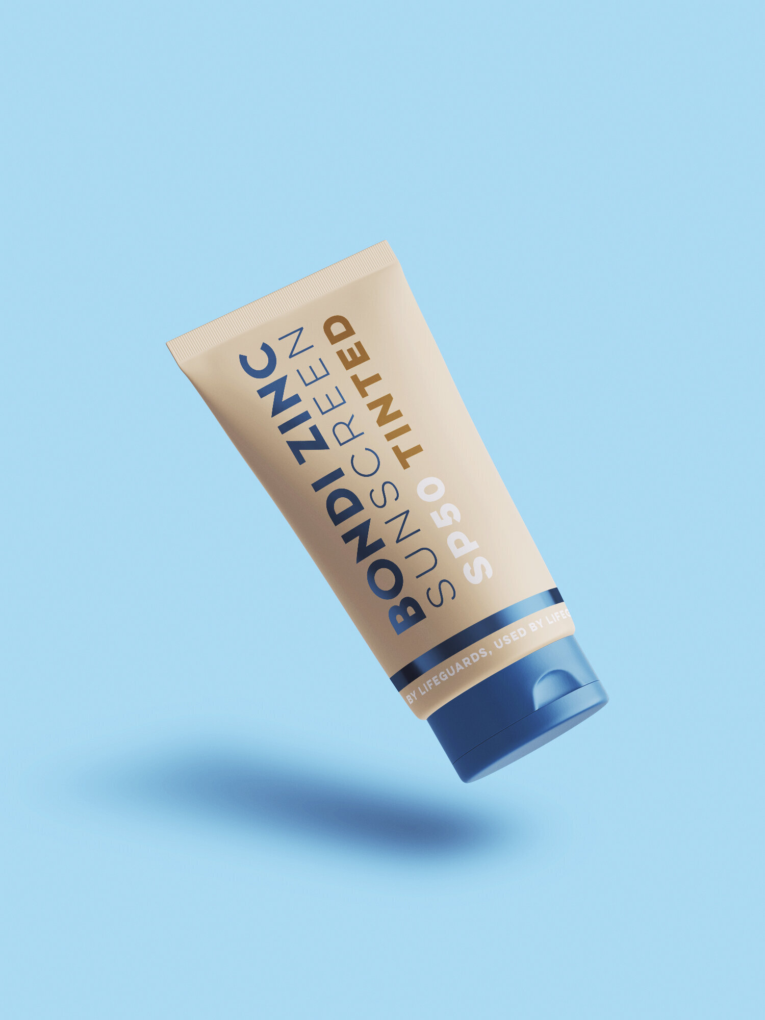
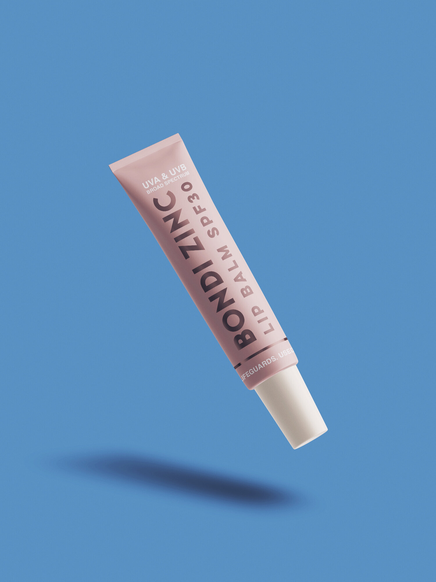
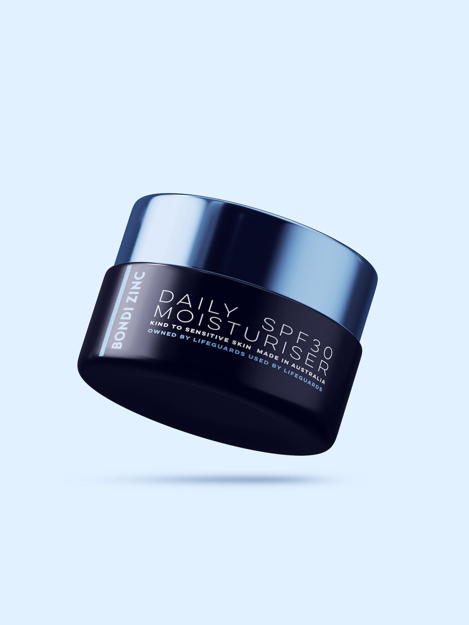
The product page presents clear information about the product, active ingredients, shipping and returns. I carried on the brand’s new fonts along with my imagined colour palette into redesign the packaging of their whole product line up. Keeping true to the original packaging of light blue with dark blue text (lifeguard uniform inspired?) but with a sleeker, more modern feel. Changing colour combinations keeps each product recognisable but unique.
To flesh out the shop and properly showcase the custom coded filter function, I added a few extra products to the range.


